
Service and Passion Projects
Cartography and GIS
The UC Placemaking Initiative
Software used: R / RStudio, Leaflet, JavaScript, HTML, CSS
From the The UC Placemaking Initiative website:
The UC Placemaking Initiative is a multi-campus network and public platform created in 2018 to support, study and amplify place-based research of UC artists, designers and media practitioners who are working across disciplinary fields in collaboration with multiple stakeholders to enact environmental and social change. This work brings visibility to UC’s core public research mission as a land-grant institution, committed to pedagogy and scholarship that directly serve the needs and interests of California’s diverse publics. As a cultural practice, placemaking engages the core values of diversity and equity as guiding principles to advance access and participation by those often underrepresented or excluded from the public process.
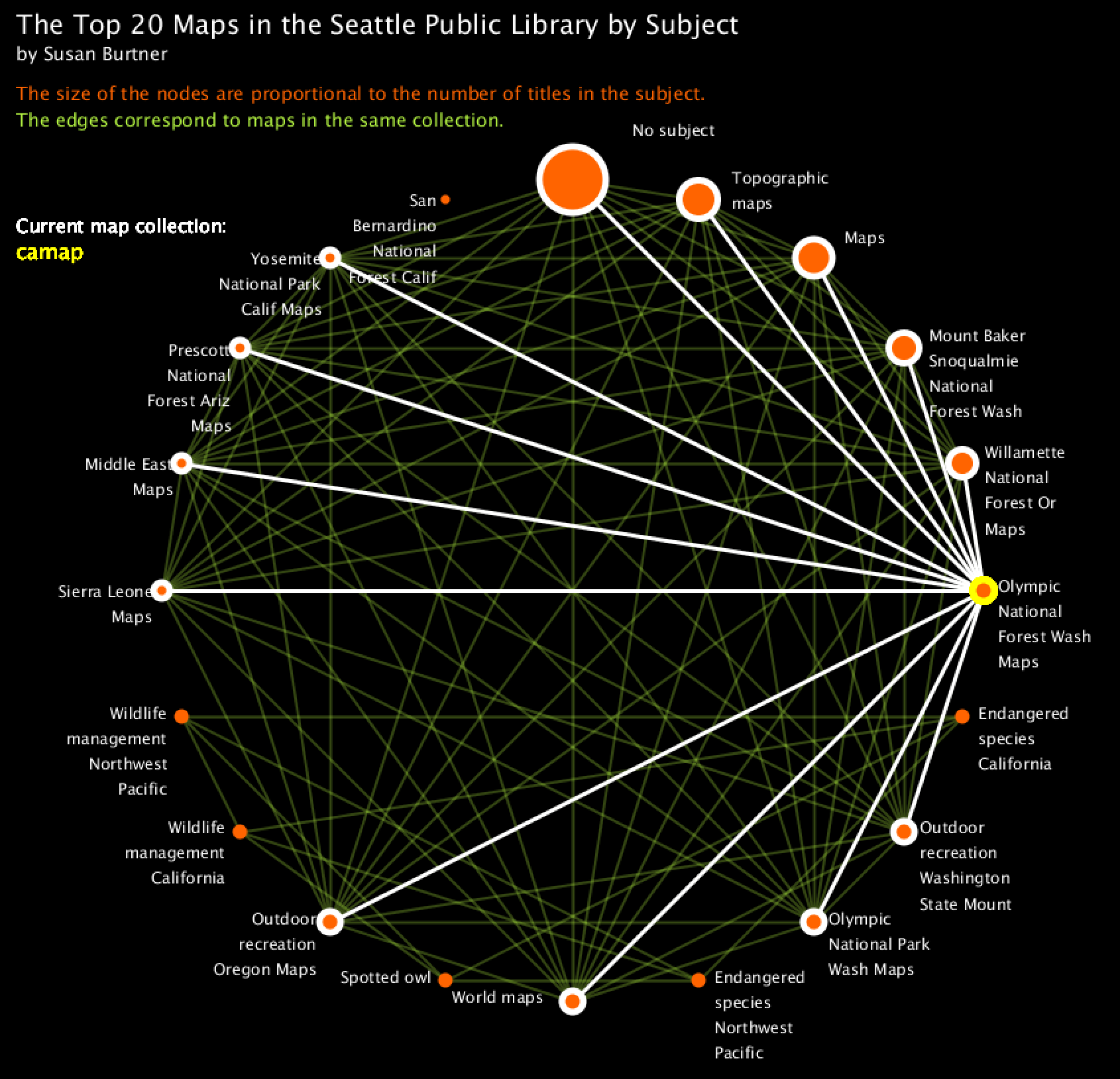
I joined the University of California, Davis Placemaking team to help create a map of all of the initiative’s affiliations between projects and people: who works with whom and where do practitioners reside in terms of their geographic location as well as their place-based organizations. A copy of the map of these affiliations is given below. You can view affiliations by people or projects, and the websites associated with collaborators are attached as attributes on the nodes and edges of the network.
Algorithmic Visualization
Software used: Processing, SQL
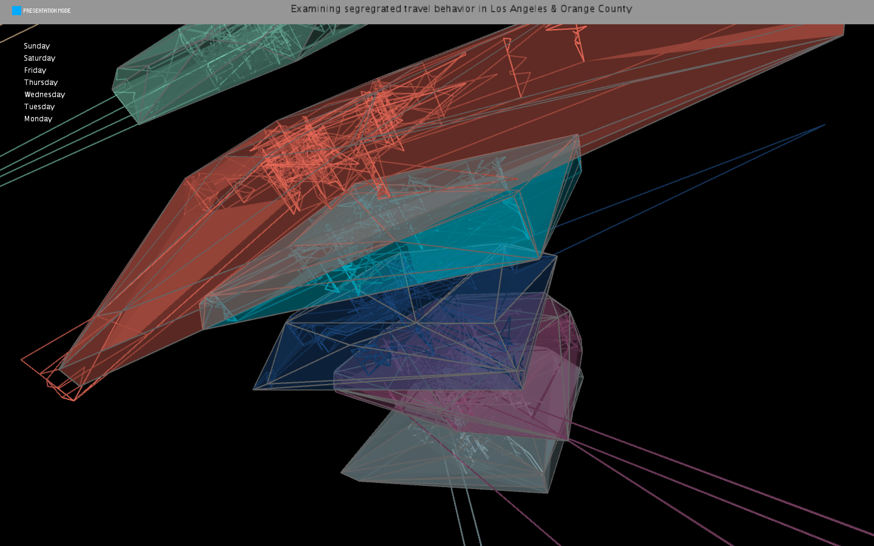
MAT259 is a class on Algorithmic Visualization in the Media Arts and Technology department at the University of California, Santa Barbara. I took this class in anticipation of visualizing highly dimensional travel activity data, so my projects centered around using geographic data. While the projects require Processing to render their interactivity, below are links to static images of the second assignment and the final project:
Critical Infrastructure Project
Software used: ArcMap, ArcScene, Github
English 238 is a class on Critical Infrastructure in the English department at the University of California, Santa Barbara. The field of critical infrastructure broadly examines how the digital humanities are uniquely positioned to interpret and critique the infrastructual elements of “culture” which simultaeously fulfill and constrain human experience. The final project for the course involved creating a public “Starter Kit,” a website that consolidated a series of blog posts that introduce a topic within critical infrastructure. I chose to explore how the natural environment is seen as infrastructural, and how the process of “daylighting” a creek can serve as an act of both environmental and cultural restoration. Below is the last webpage of my “Starter Kit” project.
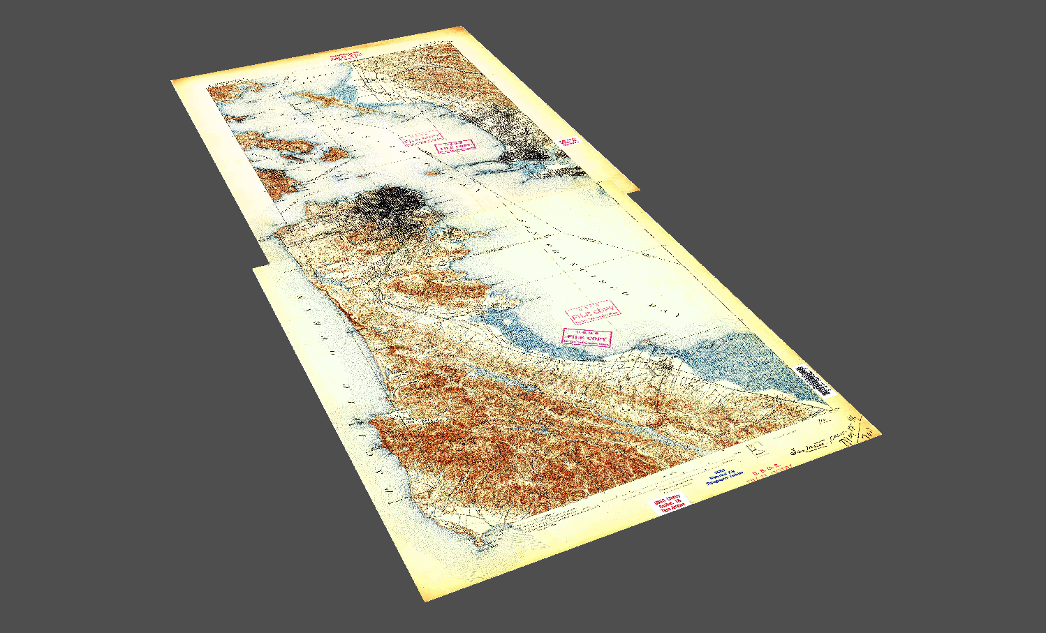
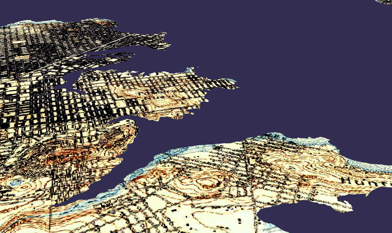
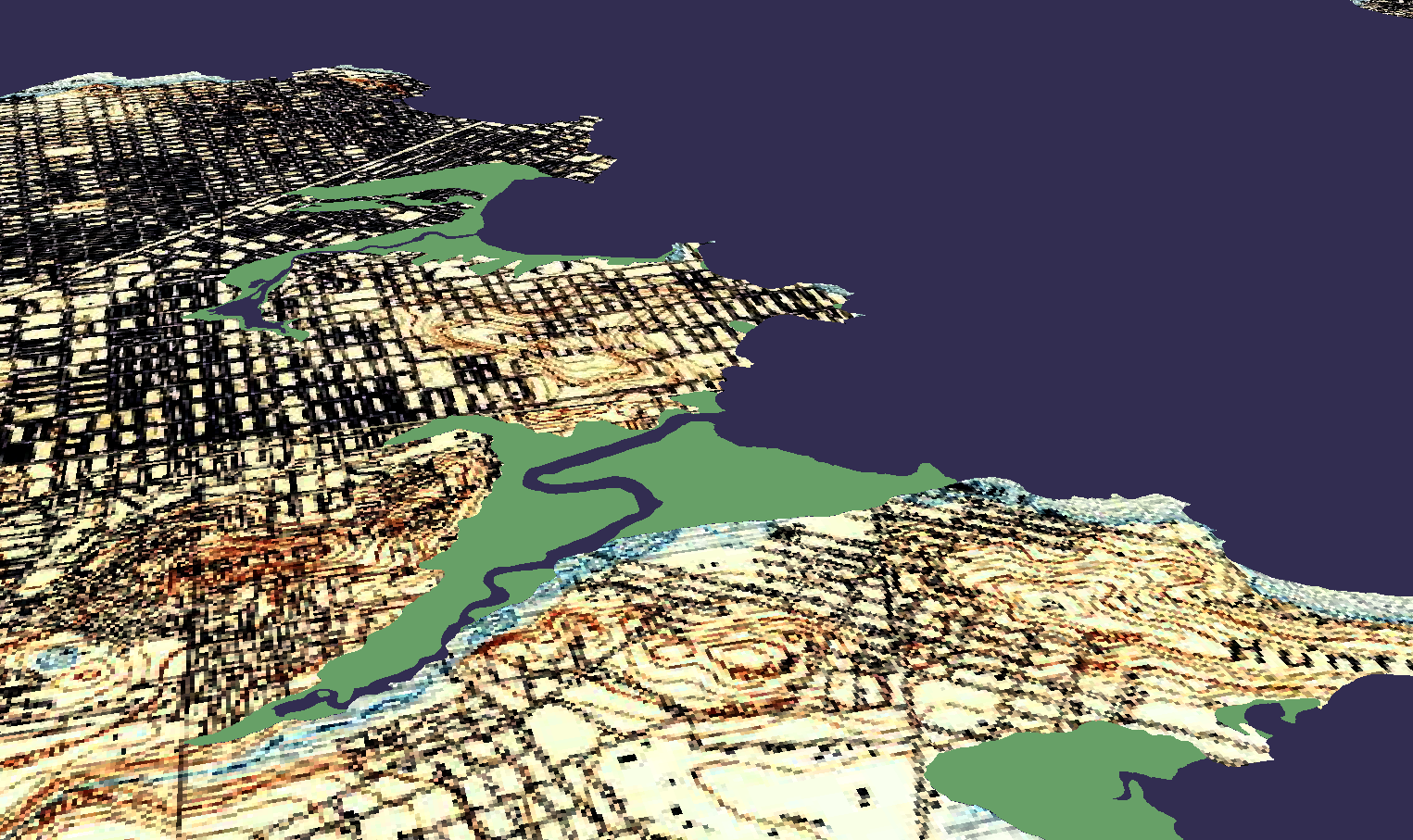
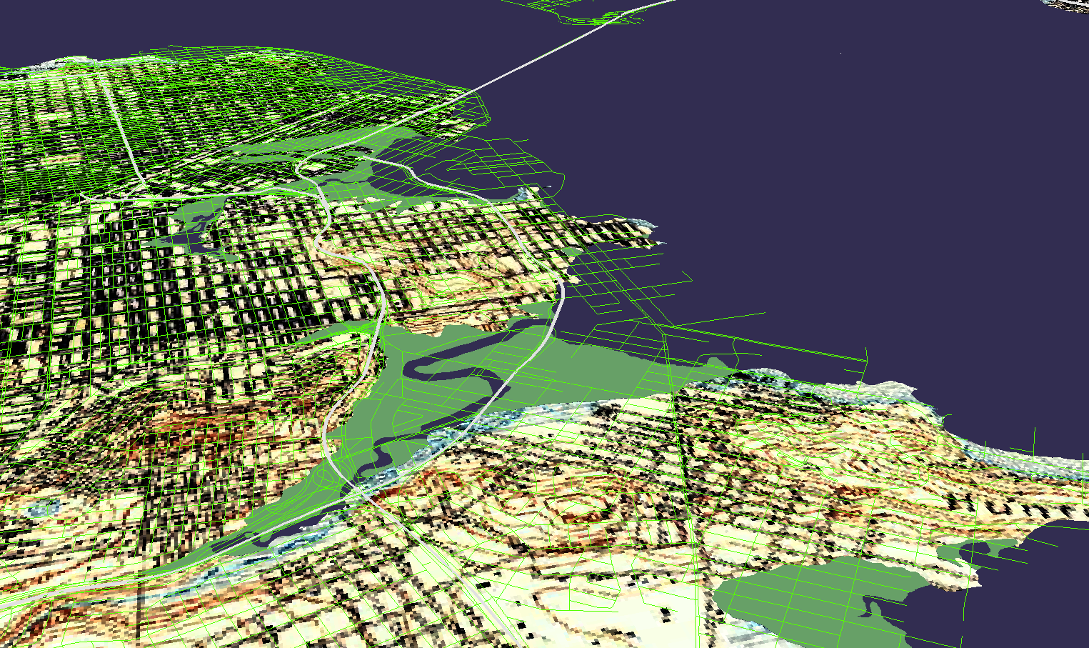
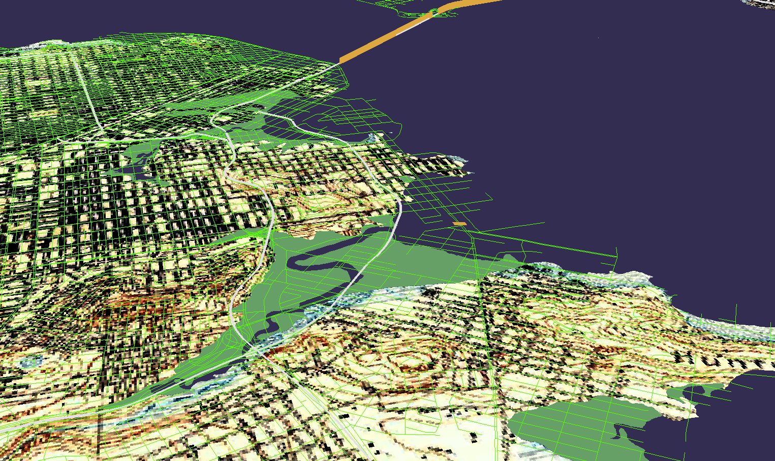
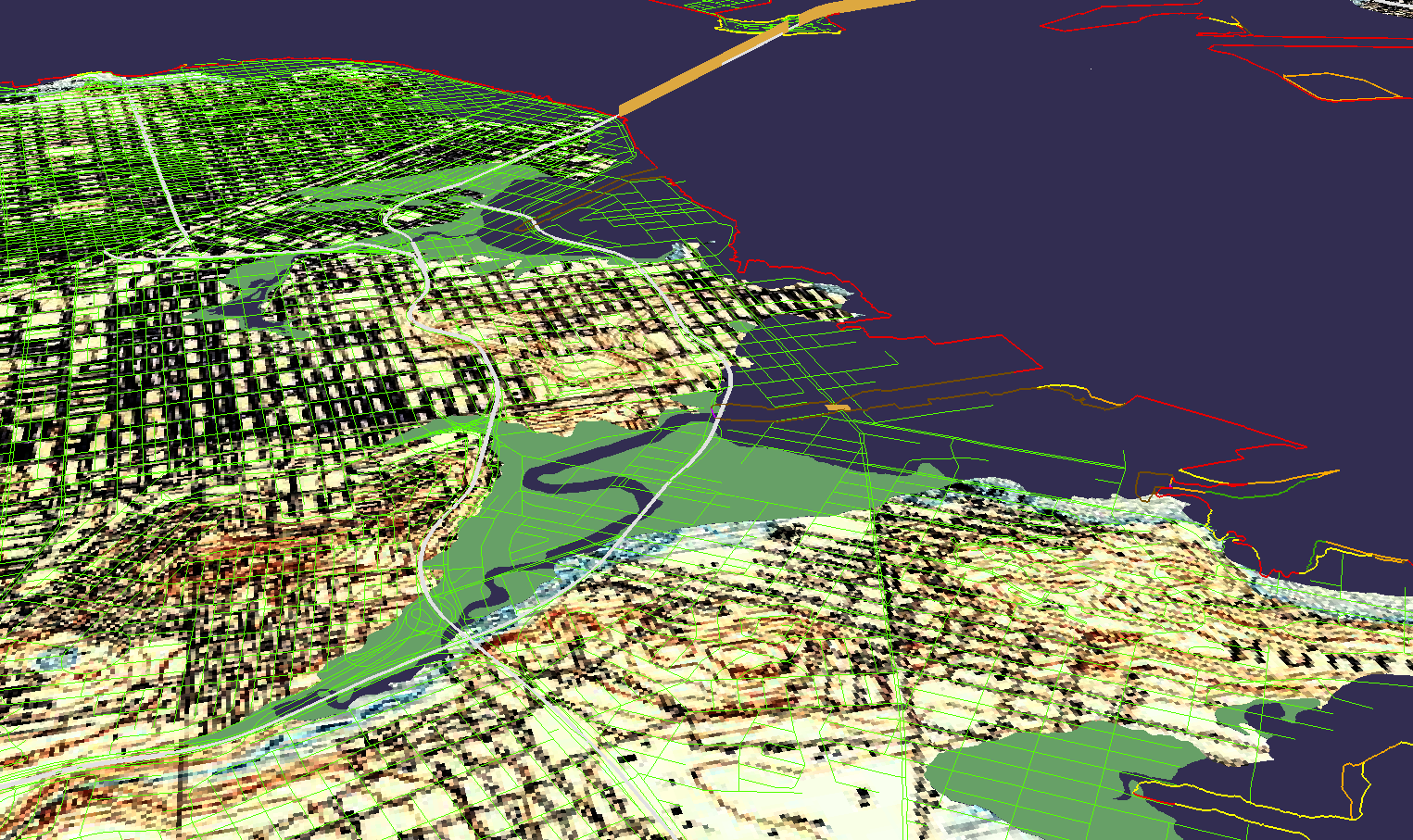
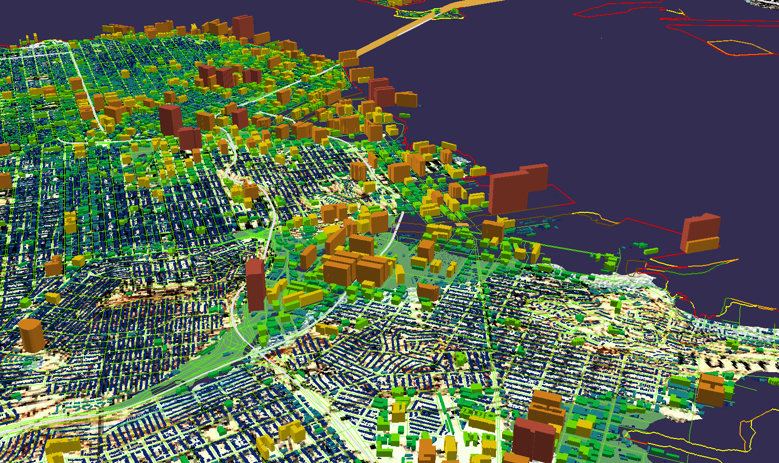
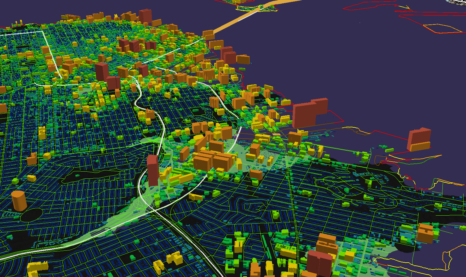
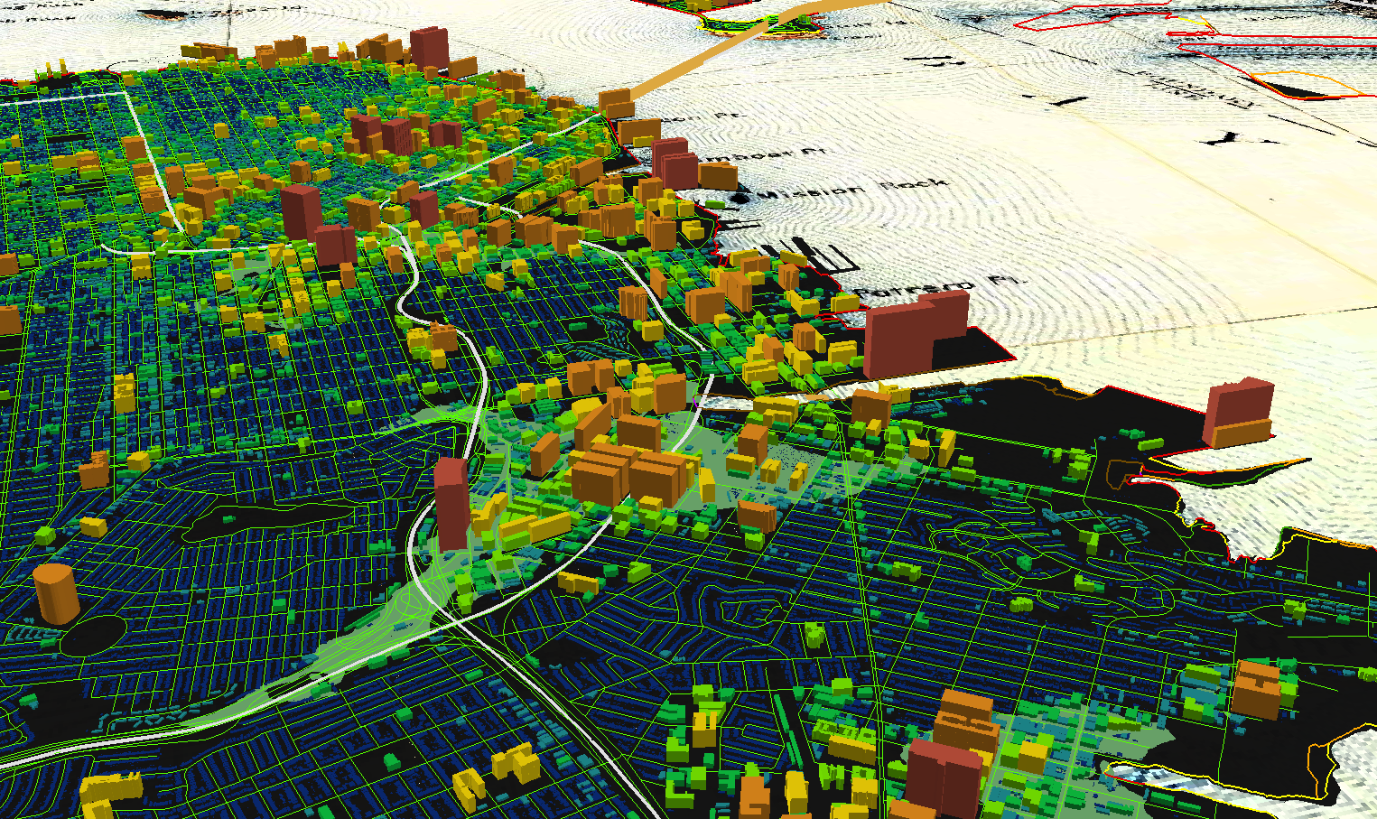
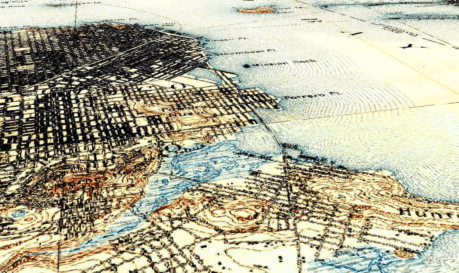
Daylighting Islais Creek through Maps
A map is a representation of the physical world, and it communicates a story through a careful management of shapes, colors, textures, and layers. This Starter Kit is a geographic information science (a mapping) approach to critical infrastructure, and tries to separate out the infrastructural components of a city at the urban-water nexus. The urban-water nexus describes the geographic areas at which humans and water interact. Central to this approach is the consideration of climate change, and how its increasing variability and unpredictability will affect human life.
One attempt to address the challenges of climate change at the urban-water nexus is to revitalize more sustainable practices in water management. Decades of urban development have redirected many creeks, rivers, and streams to underground culverts, which sometimes results in flooding and destruction when capacity is reached. “Daylighting” these water bodies allows them to follow more of their natural flow and makes them less prone to flooding. The technique is increasing in popularity as the urgency to address climate change intensifies, and can involve cultural restoration too. As someone who loves water and the Bay Area, I feature Islais Creek in San Francisco, California, as my area of interest to daylight. I choose to layer those traditional infrastructural elements of an urban environment such as highways, roads, bridges, and buildings with aquatic features such as shoreline, marshes, and rivers. Each map layer “daylights” some aspect of urban and aquatic infrastructure across time and space, and culminates in a series of maps that I call NEXUS. In NEXUS, one can see all of the urban structures of a city, but where there is water, I leave the historical map of Islais Creek, so that the map reader can be reminded of the centrality of water to urban life.
Situating this Work within Geography
Geography is an incredibly diverse and broad field. While a general definition of geography might be “the study of the physical features of the earth and its atmosphere” as well as the “human activity as it affects and is affected by these,” I would describe the field of geography as encompassing any theoretical development or empirical research that privileges a perspective of “space” and “place.” If you are exploring how the location of a phenomenon affects the nature of the phenomenon, you are doing geographic research!
Here at the University of California, Santa Barbara, geographic research interests vary considerably across human geography, physical and atmospheric sciences, climate change, space/time knowledge and organization, and geographic information systems (GIS). A GIS allows a researcher to layer multiple aspects of geographic information for analysis or visualization. With my first Starter Kit, I try to communicate a bit about the spatial and geographic qualities of the critical infrastructure present at my area of interest, Islais Creek, through a GIS.
How the Starter Kit was Made
This Starter Kit was made using ArcScene, a product from ESRI that allows one to view geographic data layers in 3 dimensions. In a future blog post, I would like to unpack the black box that hides the technical aspects that went into making this project. (For example, I had a great suggestion to add population data, maybe to the “Urban” map, so that one might see “what’s at stake” for the people living in this area.) For now, please enjoy the layers and final product that constitute my Starter Kit: Daylighting Islais Creek through Maps.
The Starter Kit
| Islais Creek |
|---|
 |
| Historic Shoreline |
|---|
 |
| Water |
|---|
 |
| Marsh |
|---|
 |
| Roads |
|---|
 |
| Highways |
|---|
 |
| Bridges |
|---|
 |
| Modern Shoreline |
|---|
 |
| Buildings |
|---|
 |
| Urban, Water |
|---|
 |
| NEXUS |
|---|
 |
 |
Resources
| Layer | Date Created or Last Modified | Source |
|---|---|---|
| Historical Map | 1895 (SF), 1896 (San Mateo) | The National Geological Map Database |
| Historical Water & Marsh, Modern Shoreline | 1998 | San Francisco Estuary Institute |
| Highways, Bridges | 2017, 2015 | Caltrans |
| Roads | 2018 | Data.Gov |
| Buildings | 2017 | DataSF |
The Cricket Emoji
The Cricket Emoji
Software used: Adobe Illustrator, LaTeX

In the fall of 2016, I decided to write to the Unicode Consortium to advocate for the inclusion of a new emoji: a cricket. My motivation for doing so (in addition to avoiding completing my graduate school applications) stemmed from the simple fact that there was no cricket emoji, and I felt that the world needed a better way to express awkward silences through text.
The process of creating and getting an emoji accepted was wonderful. Not only was it fun to write the proposal and design the cricket in Adobe Illustrator, but I also used this as an opportunity to learn LaTeX. I have since learned there is a large emoji community, emojination, who maintain an active slack channel that helps other emoji enthusiasts get their proposals passed by the Emoji Subcommittee of Unicode.
I sat for a few radio, phone, and email interviews about the emoji, see below:
Social Equity and Justice
Social Equity and Justice
The death of George Floyd in 2020, and the national conversation on race that followed, deeply affected me and forced me to think about my own understanding of race and privilege, and how that affects my work. I joined two university groups where individuals met to educate one another on systemic racism, discussed, and developed and promoted actively anti-racist policies and practices. The first was my department’s Diversity, Equity, and Inclusion Working Group, and the second was UCSB’s Center for Innovative Teaching, Learning, and Research (CITRAL). Below are links to explore these groups further.
My perspective on diversity, equity, inclusion, and justice is this: we will never live in a just society until every individual, regardless of their race, gender, sexuality, or other aspects of their identity, has the opportunity to reach their full potential. For those of us in academia, it is morally imperative that those in positions of power embark on their own journey of learning, unlearning, and action to make the university a place of inclusion, safety, and belonging.